Introduction :
In today’s fast-paced business environment, organizations are increasingly reliant on data visualization to interpret insights, identify trends, and drive strategic decisions. Microsoft Power BI stands out as a premier data analytics platform, offering a wide array of visualizations that help convert raw data into compelling, actionable intelligence.
Choosing the right visual elements in Power BI is not just about aesthetics—it’s about making your reports clear, intuitive, and impactful. This article explores the most effective Power BI visualizations and how they can elevate your dashboards to new levels of professionalism and clarity.
Why Visualizations Matter in Power BI :
Effective visualizations are essential for communicating data clearly. They simplify complex datasets, expose hidden insights, and foster better decision-making. In Power BI, choosing the appropriate visual for your data type and analysis objective ensures that your audience can interpret the information accurately and efficiently.
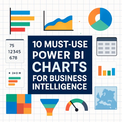
Top Power BI Visualizations and Their Use Cases :
1. Clustered Bar and Column Charts :
Purpose: Comparing quantitative values across categories
These visuals are ideal for side-by-side comparisons, such as regional sales performance, departmental costs, or customer segmentation. Bar charts display horizontal comparisons, while column charts show vertical ones.
Best Practice: Use data labels and axis formatting to improve readability in dense datasets.
2. Line and Area Charts :
Purpose: Illustrating trends over time
Line charts are excellent for displaying continuous data such as revenue trends, user growth, or seasonal patterns. Area charts add depth by highlighting the magnitude of change beneath the line.
Best Practice: Overlay multiple metrics to reveal correlations or divergences over time.
3. Pie and Donut Charts :
Purpose: Showing part-to-whole relationships
These charts are useful for illustrating proportional data like market share, budget allocations, or product mix.
Best Practice: Limit to five or fewer segments to avoid visual clutter. For more categories, consider a bar chart instead.
4. Table and Matrix Visuals :
Purpose: Presenting detailed, structured data
Tables are perfect for viewing individual data points, while matrices allow for drill-down capabilities and summarization through row and column groupings.
Best Practice: Apply conditional formatting and sorting for more intuitive data interpretation.
5. Card and Multi-Row Card Visuals :
Purpose: Displaying key performance indicators (KPIs)
Card visuals are used to highlight single metrics, such as total revenue or average order value. Multi-row cards present several KPIs in a compact, dashboard-friendly format.
Best Practice: Use these for executive summaries and high-level dashboards where clarity is critical.
6. Treemaps :
Purpose: Visualizing hierarchical data within limited space
Treemaps represent categorical data through nested rectangles, making them ideal for analyzing proportions within a hierarchy—like sales by product category or department-wise expenditures.
Best Practice: Pair with filters or slicers to allow deeper interaction with the data.
7. Funnel Charts :
Purpose: Depicting stage-based processes
Commonly used in sales and marketing dashboards, funnel charts illustrate conversion rates or drop-off points through stages—such as lead to opportunity to closure.
Best Practice: Combine with DAX measures to calculate stage-wise performance metrics.
8. Waterfall Charts :
Purpose: Showing incremental change in value
Waterfall charts help visualize how a starting value is affected by a series of positive or negative changes, such as profit analysis or budget variance.
Best Practice: Use color coding to clearly differentiate increases, decreases, and totals.
9. Gauge and KPI Visuals :
Purpose: Tracking performance against targets
Gauge visuals offer a simple, intuitive way to see whether a metric meets predefined thresholds. KPI visuals integrate trend indicators and status flags for better contextual performance monitoring.
Best Practice: Use sparingly and only for critical metrics where targets are clearly defined.
10. Map Visualizations :
Purpose: Displaying geographically distributed data
Maps in Power BI (including basic, shape, and ArcGIS maps) enable users to analyze data by location—such as customer distribution, regional performance, or logistics mapping.
Best Practice: Ensure accurate geographic data and apply tooltip customization for enriched user experience.
Bonus: Leverage Custom Visuals from AppSource
Power BI supports an extensive library of certified custom visuals available through Microsoft AppSource. These include:
- Gantt Charts for project timelines.
- Bullet Charts for performance vs. target comparison.
- Sankey Diagrams for flow-based data analysis.
- Chiclet Slicers for custom filtering options.
Best Practice: Always validate the credibility and compatibility of third-party visuals before implementation.
Guidelines for Selecting the Right Visualization
To maximize the effectiveness of your Power BI dashboards:
- Understand the data structure and analysis objective.
- Match the visual to the message you wish to convey.
- Avoid information overload—use white space strategically.
- Apply consistent color schemes to aid visual processing.
- Incorporate interactivity (e.g., slicers, drill-throughs) to improve user engagement.
Conclusion :
Data visualization is more than just a design choice it’s a strategic communication tool. By leveraging the right Power BI visuals, you can present insights more clearly, drive better decisions, and differentiate your dashboards from the rest. Whether you’re creating reports for executives, analysts, or clients, selecting the appropriate visualizations ensures your data not only informs but also inspires action.
Explore these Power BI visual types, experiment with combinations, and turn your dashboards into data storytelling masterpieces.